A collection of bad designed websites of famous brand I stumble up on.
Episode 3: Going Local
After some friends reccomandations of ugly websites I couldn't ignore, here we are are for another episode. This time I went local. Pedavena is perhaps the most famous restaurant and brewery in the city of Trento. Despite the good fame and the sublime dinners in the mind of the citizens, their website does only one thing good. It makes you throw up. That's really sad.
If you suffer epileptic seizures don't visit this website. You have been warned.
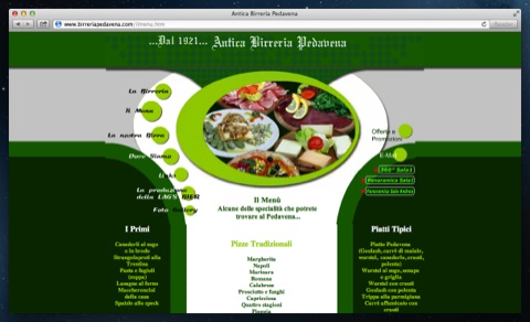
This site is perhaps the most representative of the dark age the web had before its renaissance of this years. Flash. Ugly and annoying animations. Poor typography. Poor content curation. Indecent Photography. I think it should be shown to every person willingly to learn web design as a "1001 Thing you should not do on the web" example.
Please, consider giving your web guests the same awesome threatment they get when entering your local.
To the managers: You need a better website. Now. Absolutely.
Episode 2: Coldplay
This episode is a huge find! Coldplay is a world famous indie rock band. They do concerts all over the planet and their fan base can be counted in millions. I'm not really a big fan of the band, but, when I came across their website my eyes started bleeding. Who the hell designed this?
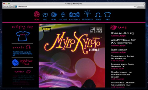
It's really a shame such a world famous band doesn't engage their fans in a proper way. I aknowledge their music might be awesome for million of people, but that's not an excuse to trascurate their website's design.
Episode 1: Grom
Grom is a leading ice cream retailer. The way they make ice cream and sell it, is exemplar. Their shops are awesomely designed and the experience you get from walking into one is almost comparable to the one you get in Apple stores.
But. Their website incarnates everything bad from the last decade of webdesign. Poor reading experience, ugly animations, bad content strategy. They can do much better than this with little effort.
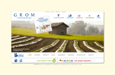
If anyone from the design department at Grom is listening, I would love to work on a redesign with you. Something that gives your web visitors the same experience you get by walking in one of your shops, and leave with a good ice cream and a smile.
First tip: Remove the sound from the news link.
Are you a brand owner and your web site appears in this list? Probably your visitors deserve a better experience. Once you made your website better contact me for a revaluation.
Stay tuned for more episodes.